Balancing Design Goals and Priorities
Prioritize getting the whole product right and not just some part of it
Thanks for reading the ProductFix newsletter. Right now, I am sharing insights into running product based on real world situations I encounter as the VP Product @ Fairwords, connecting concepts with practice. It is not all pretty but it is real.
Recently, the US Department of State decided that they needed to change their official publication font from Times New Roman to Calibri. This set off quite a firestorm in a very small community that cares deeply about the impact of fonts on accessibility and tradition.


Anyone that has done some research on fonts knows they can be powerful in what they communicate, how functional they can be, and what emotions they might impart to your readers. The choice of Calibri is intended to make government documents more accessible, especially when combined with a standard 14pt size.
This is the type of detail that designers and product managers need to think about when building great products. Font selection impacts usability, tone, and brand.
Fairwords New Design
In late 2021, we were in the process of designing a new foundation for our product portfolio. This was going to be a major architectural lift but it was also a significant redesign of the user experience that many employees at our customers would experience. I wanted to take a very deliberate approach to font selection and tone in our products.
I have built many products but font selection rarely made its way to the top of the priority list. This time would be different. Font, microcopy, and color — everything was going to be designed with intention.
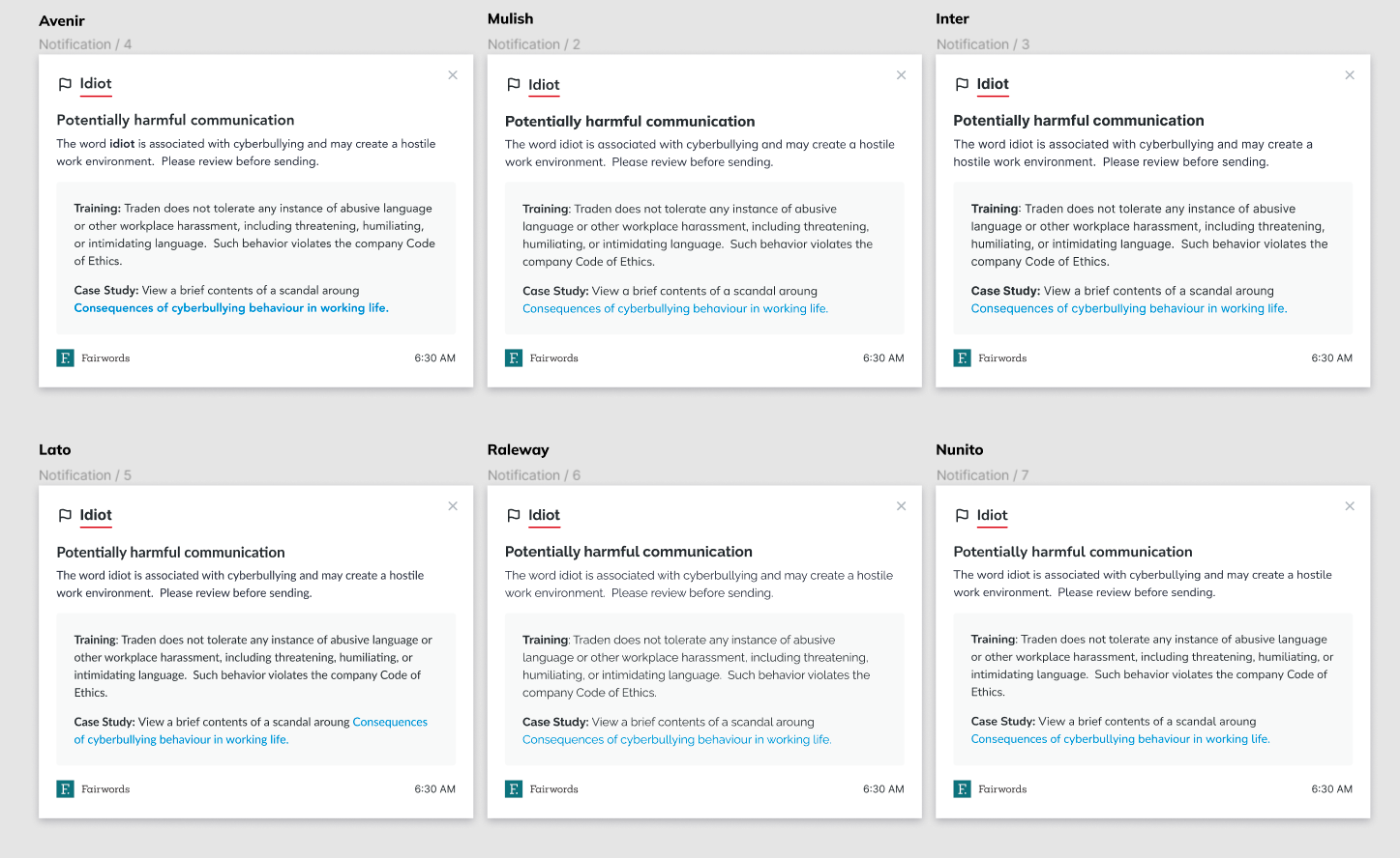
After narrowing down our font selection based on a variety of objective and subjective rationale we felt we had the perfect font — Avenir. Highly readable, sans, and could allow a high density of content without feel heavy. I loved it.
In parallel our marketing team was leading us through a company rebranding that, surprise, also involved fonts, colors, logos, and copy tone. On the short list for fonts was something that look familiar. It was Avenir!
As a team that was trying to make all the right, deliberate decisions, we wanted our applications and marketing brand to be complementary. It creates a more consistent story and brand for users.
The decision was now very easy — we would use Avenir as our primary font.
Wait. Something is not right
Fast forward a few weeks as we were fast approaching a first milestone release to the market and we discovered a problem. For some reason our app was not rendering as nicely across Windows and Mac.
I actually noticed this for a little while but my primary computer is a Mac. On Mac, our application was looking gorgeous (IMHO). Yet, on Windows, the screens just looked off. Some text was blurred and bleeding over borders. Screenshots for marketing materials looked funky when done on Windows PCs.
It turns out, Avenir is not installed on Windows by default. Therefore, our application was falling back to alternate sans fonts. Some more research determined we could pay to license the font and then we would have to “ship” the font to ensure our application looked equally great everywhere.
What to do?
After understanding the situation fully, with just a few days before launch, we had to decide on licensing the font or switching fonts altogether. Mind you marketing already progressed heavily with our decision.
We started to hunt for alternatives and found there was nothing that was a near perfect replacement. There are many design posts and expert lists that recommend alternatives but those opinions generally differed. They differed because nothing was a good as Avenir.
On the flip side, licensing and delivering our preferred font, did not appear to be commercially viable for us. I possibly could have accepted the cost, but with a goal of producing a product with really good unit economics means not piling on incremental costs unless they could later be replaced or were critical to delivery.
Time for Pragmatism
As I said, for Fairwords new platform, we wanted to do things right. However, doing things right has many dimensions that need to be considered. In this case, adding cost could not be justified against the benefit of a superior experience.
Furthermore, while we could have easily started with Avenir and then switched later, we did not want to initially launch knowing we would have to change it later. This would disrupt the experience of all our users and brand identity.
We had to take the fastest, most pragmatic approach and chose an alternative that best met our original selection criteria — plus work flawlessly across operating environments.
What’s more, we decided to break the consistency in design with marketing. These decisions were painful. We had sunk cost and grown to love the look Avenir enabled.
Our engineering team made the switch in minutes. It did take a bit longer to QA it, given this was not something that could be automated.
Just like that, Avenir was gone from the product.
Lessons
Months later, no customers have said anything about our fonts. Really, users don’t tend to comment about things like that unless they are really bad. Our marketing materials look great in Avenir — even with a healthy dose of product screenshots not in the same font.
The decision to go with Avenir or an alternative would probably not have had a significant impact on top line revenue or UX. It is easy to want to do so much right and get lost in the fact that doing every individual thing right is not actually the goal. The goal is doing the WHOLE thing right, or as best we can.
One more thing, in case you were wondering. The font we finally settled on… Lato. Not bad, if I say so myself. (Even on Windows)


